Historical perspective in an urgent moment: the financial health of the social sector, 1998-2017

The economic dislocation brought on by coronavirus has shaken the social sector to its core. Leaders wonder aloud if we will soon see mass bankruptcies of nonprofit organizations—just at a moment when their services are most needed. We’ve seen a response: in the United States, the federal stimulus offers billions to the nonprofit sector, and many donors are changing their practices. But it is not clear if these actions will be enough, and many in the field face difficult questions with practical implications: should my foundation increase payout? Does my nonprofit need to lay off staff or sell assets? Is this the rainy day we’ve been waiting for?
These questions can be informed—if not answered—by a historical perspective. We at Candid have been digging through our archives of data to see what the past might offer social sector leaders facing such consequential decisions. (For example, see this analysis for lessons from foundations’ response to the Great Recession.)
Given the urgency of the moment we wanted to share data as quickly as possible. Caveats are in order: please see the methodology section below for a set of important cautions.
For this exercise, we have looked at data on the United States social sector from 1998 to 2017, a window where we have relative confidence in our aggregate data. It is worth emphasizing that this is data about the social sector as a whole. It tells a story of how “we”—the social sector—have done in aggregate. It does not tell the countless individual stories of struggle and triumph of “we” as separate organizations. In a forthcoming piece, we will look at the distribution of financial health—and fragility— across the social sector.
Finding #1: The social sector economy has grown significantly over the last two decades
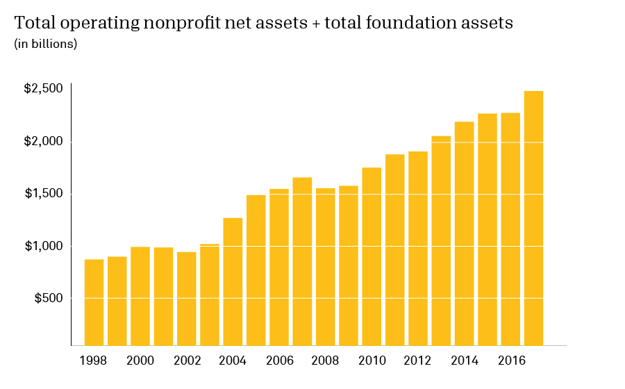
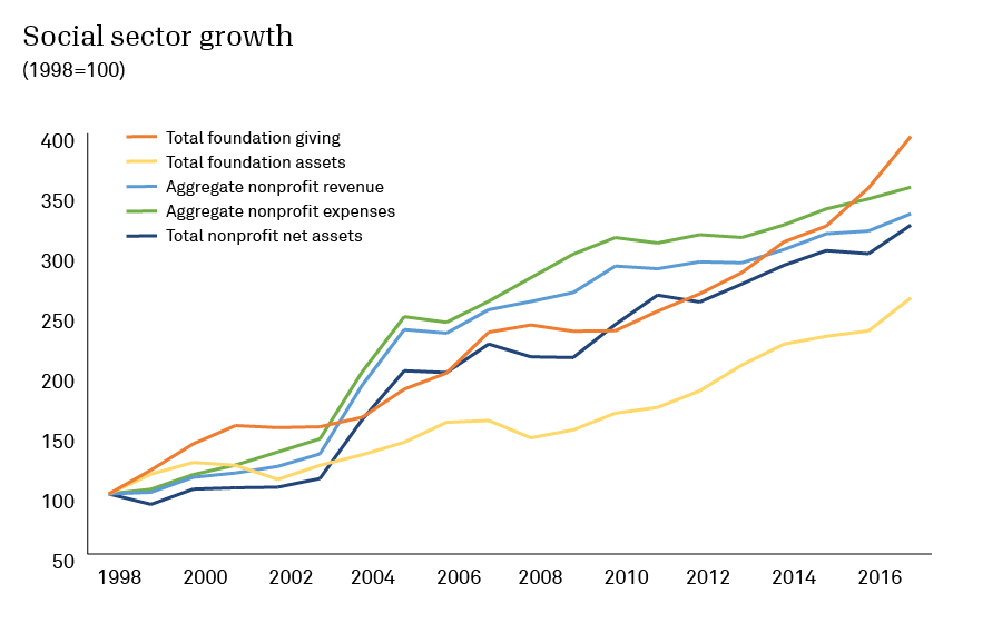
It is no surprise that the social sector has gotten bigger over the last two decades. But the scale of the growth is notable: the sector’s net assets have increased by nearly $2 trillion. Although the sector has grown across all major dimensions, that growth has happened at different rates. In the “Social sector growth” chart, we’ve set a variety of different metrics equal to 100 at the start of our time period. This allows us to visualize relative growth among metrics at very different scales. (In a future piece, we will explore a surprisingly elusive metric of social sector growth: the number of organizations.)
Finding #2: In aggregate, the social sector has shown a financial surplus every year for two decades—even during financial health crises
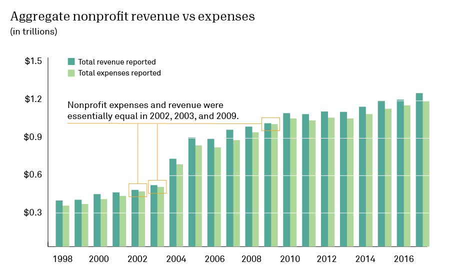
In aggregate, growth in nonprofit revenue has been matched by a growth in nonprofit expenses. This is to be expected: expenses are required to generate (and justify) nonprofit revenue. At the same time, most nonprofits feel a clear mission imperative toward growth in programs and thus expenses.
Notably, the nonprofit sector has managed to end each of the last 20 years with an aggregate surplus. The nonprofit community has built saving for a rainy day into a kind of collective business model. So how do we explain why many nonprofits struggle with little to no cushion? As we often see in the modern economy, the answer is inequality: the strength of larger organizations obscures the precarious nature of many nonprofit business models.
This alignment between revenue and expenses reflects many factors, including pass-through grants and expense reimbursement business models. But it still points to a larger lesson: the nonprofit sector as a whole has been very good at calibrating total expenses according to what that year’s revenue can bear.
If we focus on the economic crises of the last two decades, we see that nonprofit expenses and revenues converge to be essentially equal (see 2002, 2003, and 2009). So even in periods of economic crisis, the nonprofit sector did not dip into its collective reserves. The story, of course, is very different for many individual organizations.
Finding #3: Foundation assets and giving have grown with the economy, but they track the S&P 500 more closely than GDP
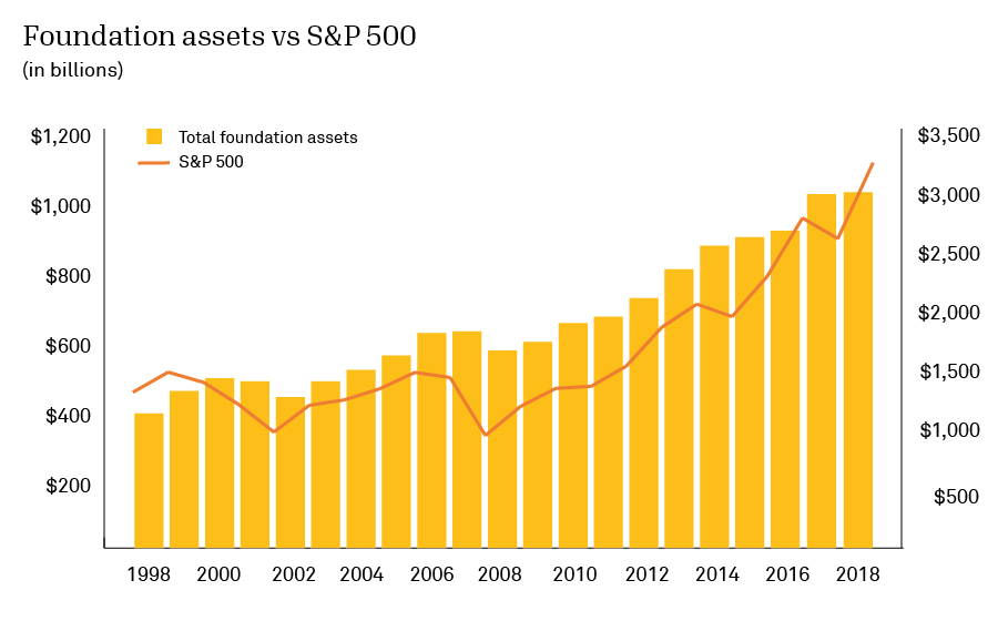
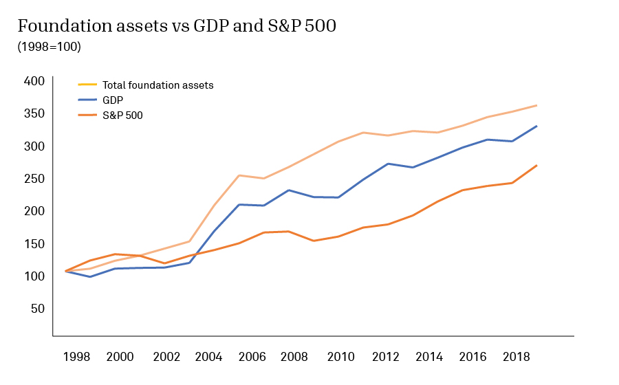
Foundation endowments grow in relation to the broader economy. As assets increase in value, foundations have more capital to work with. It is worth emphasizing here that the economy and the stock market are not the same thing. The economy as a whole has significant inertia and is less subject to the whims of investors. In these charts, we are using GDP as a measure of the size of the economy. The GDP also has limitations: it tracks economic activity whether or not that activity is good for society (e.g., a car wreck increases GDP).
Foundation assets ultimately flow from whole-of-the-economy measures such as GDP—but on a year-to-year basis, they more closely track measures of financial market activity such as the S&P 500. For further analysis of foundation giving during the last financial health crisis, see this Candid Blog post.
Closing thoughts
As this crisis evolves and leaders throughout the social sector make decisions about an uncertain future, my colleagues at Candid and I will continue to comb through our data to find lessons the past may offer. Our next analysis will look at the distribution of financial health across the field. That is, what can we see about the financial health of individual organizations? That view from the front lines is more grim.
This analysis was made possible by my colleagues Anna Koob, Carol Brouwer, David Wolcheck, Holly Ivel, and Larry McGill.
Methodological notes
- This analysis relies primarily on data from organizational tax returns. That data is invaluable but not immune from error and reflects shifts in definitions and requirements from the IRS. Data was pulled for nonprofit organizations registered with the IRS that filed either a Form 990 or 990-EZ. (Form 990-PF filers and community foundations filing any form type were excluded.) All IRS subsection types for tax exempt organizations were included, so this list encompasses more than just 501(c)(3) charitable nonprofits.
- Internal data capture rules have limited the amount of data available for certain years and filer types, resulting in occasional fluctuations in values at specific points in time. Data for tax years older than 1998 is generally unavailable. Organizations not required to file an annual return as of 1998, such as smaller or religious ones, are under-represented.
- The data we are presenting here is in aggregate form: we are adding up across the sector, not describing individual organizations. Outliers were eliminated by removing records where any value fell outside of 3 standard deviations of the mean. This decreased the record counts by about 1,000 for each year (based on fiscal year end) represented. This methodological choice removes many errors and anomalies that exist in the original source data but also leads to a modest undercounting.
- Total foundation giving and assets come from Candid’s annual research set of active (where giving >$0) U.S.-based private and community foundations. Nominal year listed may not match the fiscal year end for all included organizations; the sets are created in the first or second quarter of each calendar year based on latest available data at that time and are frozen for year-over-year comparability.
- There are underlying economic trends that play into the data. For example, the overall shift to a service economy has led to disproportionate growth in health care and education—two sectors with significant nonprofit presence. We should also highlight that values are nominal and not adjusted for inflation.
- More broadly, we urge the reader to look at long-term trends and not place too much stock in the data of a given year. There is enough complexity at play that any given data point must be considered with great humility—even as the overall trajectories can tell us something important about the evolution of the field.
About the author

Related posts

Co-leadership: A path to more diverse, sustainable nonprofits?
Dig into insights on nonprofit co-leadership to find out whether this commonplace trend of charitable organizations led by two leaders is opening the door to more overall diversity in the sector.
April 17, 2024

Youth community service: Belonging, reciprocity, and agency
Get insights into how young community service is being redefined by Gen Z and how young people are seeking to maximize their social impact—both for themselves and the communities they serve.
April 16, 2024

The Maui wildfires: A record in disaster philanthropy, an opportunity to ‘get it right’
CEP’s Tanya Gulliver-Garcia explores funding for Maui wildfires—and what learnings the record-setting response to Hawaii’s recent natural hazard hold for future investment in disaster philanthropy.
April 9, 2024

Collecting demographic data: Nonprofits value transparency but need support
Viewpoint Consulting’s Kelly Brown shares new research findings on sharing demographic data via Candid, including the drivers and barriers of collecting this information to advance nonprofit transparency.
March 28, 2024

Leveraging data to better serve under-resourced communities
Discover why data on under-resourced communities is key unlocking greater impact and better serving the needs of nonprofit beneficiaries.
March 26, 2024

Community foundations: Resilience in tough economic times
Council of Foundations’ David Rosado highlights key CF insights report findings on community foundations in 2022, including what changes in the growth of their assets and grantmaking may signal for today.
March 21, 2024
suzanne says:
Hi, Laura,
No, it is not. See note 5 at the end of the post. And thanks for asking!
Regards,
Suzanne Coffman
Editorial Director, Candid
Laura MacDonald says:
Is the data adjusted for inflation?